What I mean by style is the over-arching look-and-feel of a photographers pictures - color saturation, light vs. shade, angles, props, posing, amount of post-editing etc.. . Not just within one particular photo shoot but across the whole spectrum of the photographer's images. Some more of a definable style than others; some are just great photographers who take solid, well-exposed shots with traditional framing and posing, and don't do an awful lot with their images after taking them (except for maybe punch a few things up here and there.) Yet others seem to have a stamp that leave on every image they take (or at least, that they share.) Some of this is what they do with their camera and their subjects and some of this is what they do in post-editing programs like Lightroom and Photoshop.
Increasingly, I have been drawn to photographers in the second category.
During my second photo class recently, the teacher took one look at my fancy camera bag and deduced that I love color; strong bold, bright, splashy color. (And yes, I do, baby!) So, she suggested I check out a female photographer called Beth Jansen. (View her work here: http://www.bethjansenphotography.com/) Right away, I was hooked. Her photos have a very saturated, other-worldly quality about them and, appropriately since she takes mostly photos of babies and children, they feel as though they came straight out of a child's fairytale book. There is color EVERYWHERE and it's not just happenstance - Beth obviously considers it her trademark and provides tips for her subjects' parents about what to wear and what props to use. She probably also has a handy toolbag of her own props too, to help her inject more color into her shots. Some of the ways she frames newborns, for instance, are super cool. I've never seen work like this before in a family photographer (vs. commercial) and I was/am inspired.
And then I found an Australian photographer who, at least to my sensibilities, blew even Beth away. Her name is Barb Uil and her company is JinkyArt - great name, by the way. One of the coolest things, if you click on the company name and link-over to her site, is the video that auto-plays when you log in. It's a well-produced re-enactment of what a photo-shoot with Barb would be like for a little girl and it's A-MAZING. Barb's images are just as color-rich as Beth's and have a similar other-worldly quality about them but even more-so than Beth's, they are bathed in rich, honey light that invokes childhood summers with warm sun on your skin, and carefree, empty days in open fields with nothing to do but play and daydream. It makes you want to just jump through the computer screen and into the world of the photo. It almost brought me to tears, I have to tell you. Now how amazing is THAT!?
Anyway, all this perusing has got me messing around with Lightroom, which I purchased recently to help me punch-up my own photos. I've also been spending some time looking at old pics I took, back before I knew basically anything at all about exposure and my camera's cool buttons, and trying to learn from the mistakes I made. I've also, through learning a bit here-and-there online and experimenting through Lightroom, been able to breathe new life into some old photos that I under or over-exposed or that were great shots that lacked life or definition.
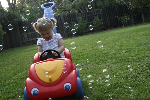
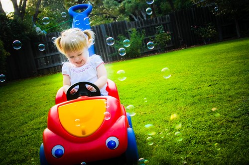
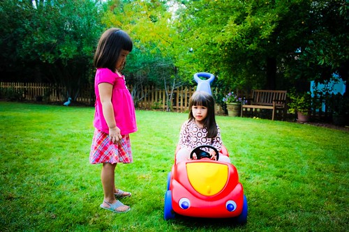
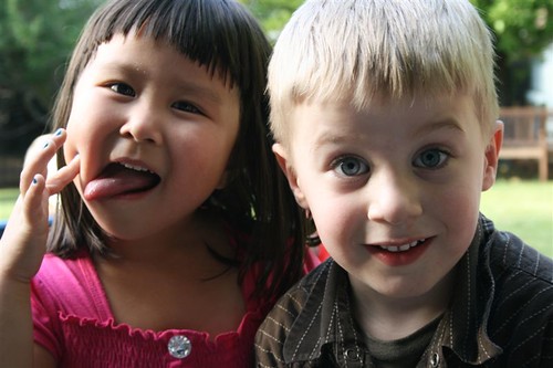
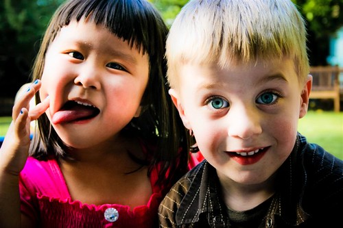
I had lots of fun last night, for instance, playing with these shots I took back in October of last year at a playdate party at my parents' house. The end result may not be for everyone, of course, but I'm playing around, experimenting, and clearly going with the saturated look. I personally like how they turned out. Let me know what you think.
BEFORE
AFTER
BEFORE

AFTER
BEFORE
AFTER
4 comments:
LOVE the color saturation. I like photos that are a tad bit dramatic :)
I recently came across this site and wanted to share:
http://photo.mattdewitt.com/main.php?page=home
Thanks Mala. I know they're a bit over-dramatic right now, maybe a tad too saturated but I like the general effect.
Matt's site is VERY dramatic, isn't it? Much more masculine, though. A lot like the guy who did my wedding photos.
I love that you are discovering your signature type of photography. The editing you did look great!
I am totally into color, especially saturation! I can appreciate them, but very rarely do I gravitate toward B&W. My eye always leads me to COLOR, my battery!
Post a Comment